キッチンの画材、鏡面仕上げかつや消しか。色々と迷いましたが、キッチンデザイナーの強いお勧めで鏡面仕上げになりました。マットの黒が最近ヨーロッパで流行っているのでマットもいいかなと思いましたが。大きな違いは、鏡面仕上げだと映り込みがあるところ。景色がみえる窓が近くにあると部屋が広く見える、というのが最大の良点だそうです。つや消しも素敵ですが、つや消しのキッチンはほとんどが窓が小さく映り込みのない場所の場合だそうで、いくつか写真を見せてもらい、納得いたしました。
キッチンデザイナーとお話する時に役にたったのは下のクリップ写真。好きな写真を見せて「こんな感じ」と言葉で説明できない部分を補います。向こうもiPadにいれた写真をスクリーンに映し出して、「ほら、こうすると綺麗でしょう」とこられると、「目で見る説得力」があります。大体のデザインは私の持っていた形をもとにしましたが、やっぱり専門家の彼に最終デザインをお願いして良かったと思います。キッチン専門なので以前お願いした建築家と違い、ゴミ箱やカテラリーの仕切り等も相談にのってくれ助かります。
 |
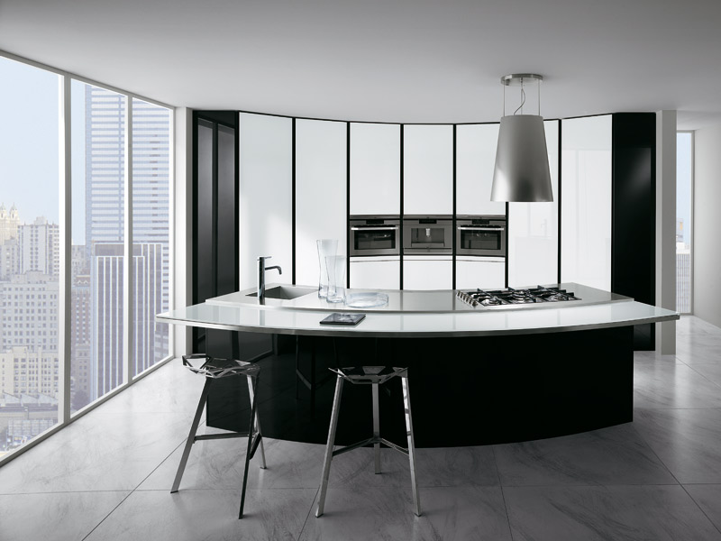
| The result is both contemporary and entirely harmonious with its surroundings, with the skilful use of anthracite and white on the exterior façade continuing into the interior. |
 |
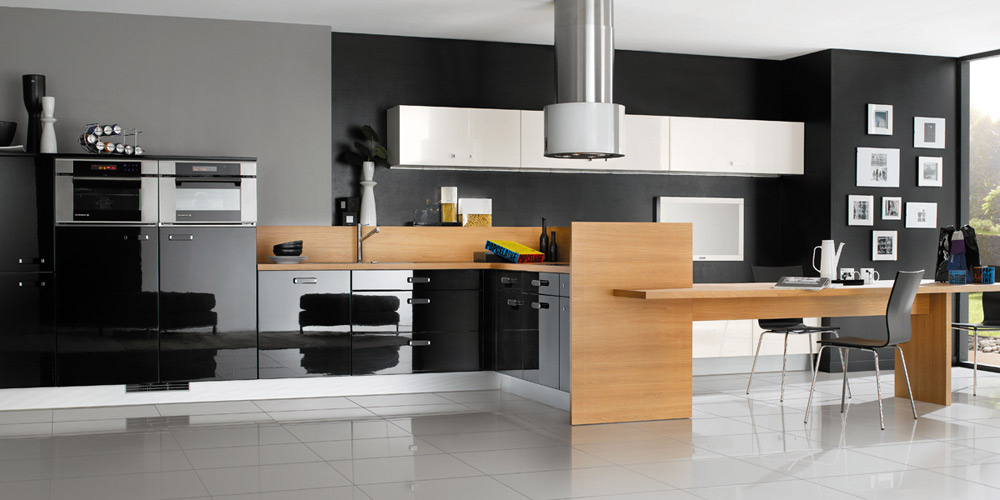
| a classic combination of satin-finish white and high-gloss black to create a modern but welcoming ambience. |
 |
Ti grey was chosen because it gives warmth without being as harsh as black, while the contrasting polar white gives the entire space a clean, spacious ambience.
  |


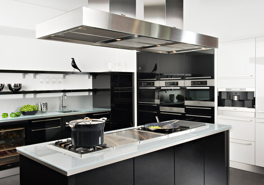
It was fun to think over a final touch for a kitchen design. I've always wanted to have a white kitchen so all the wall units/hob area will be white mirror finish but thought of a mat black colour for the island. Black mat/satin would be elegant and discrete but with a a strong designer's recommendation, we decided to go for a mirror finish. Black is neutral so it will go with red, grey, white, orange, blue, all what we have from other furnitures.
No comments:
Post a Comment